
All About the Color Blue
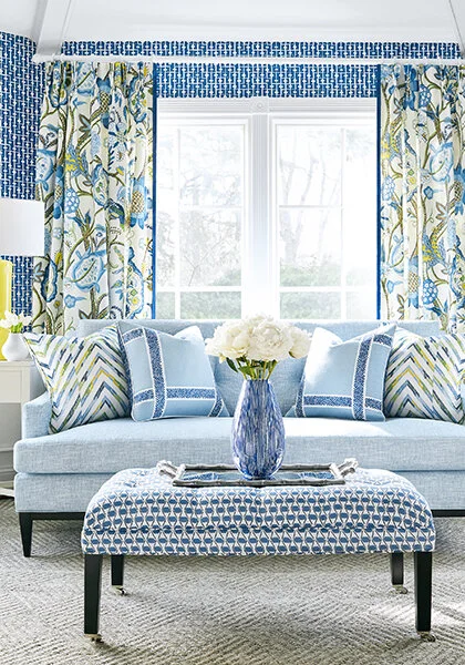
Photo Courtesy of Our Partners at Thibaut Design
Let me guess: your favorite color is….. BLUE?
If so, you’re not alone. Around 35% of the general population (42% of men & 29% of women) state that blue is their favorite color. Blue is also a very popular color choice in interior design, and it is quickly gaining traction as the new neutral (set to replace gray) in homes because of its usability throughout different rooms in the home. It easily flows with other neutrals like white, black, gray, and brown, and there are shades of blue to match almost every design style & mood. It’s truly no wonder that blue is an established go-to for those looking to add some color to their spaces without feeling too loud or obnoxious.
“Blue is the only color which maintains its own character in all its tones.”
The Basics
Blue is a Cool Color & a Primary Color. It is sharply refracted by the eyes, which causes the lens to flatten and push the blue image back. We perceive that blue areas are receding and smaller.
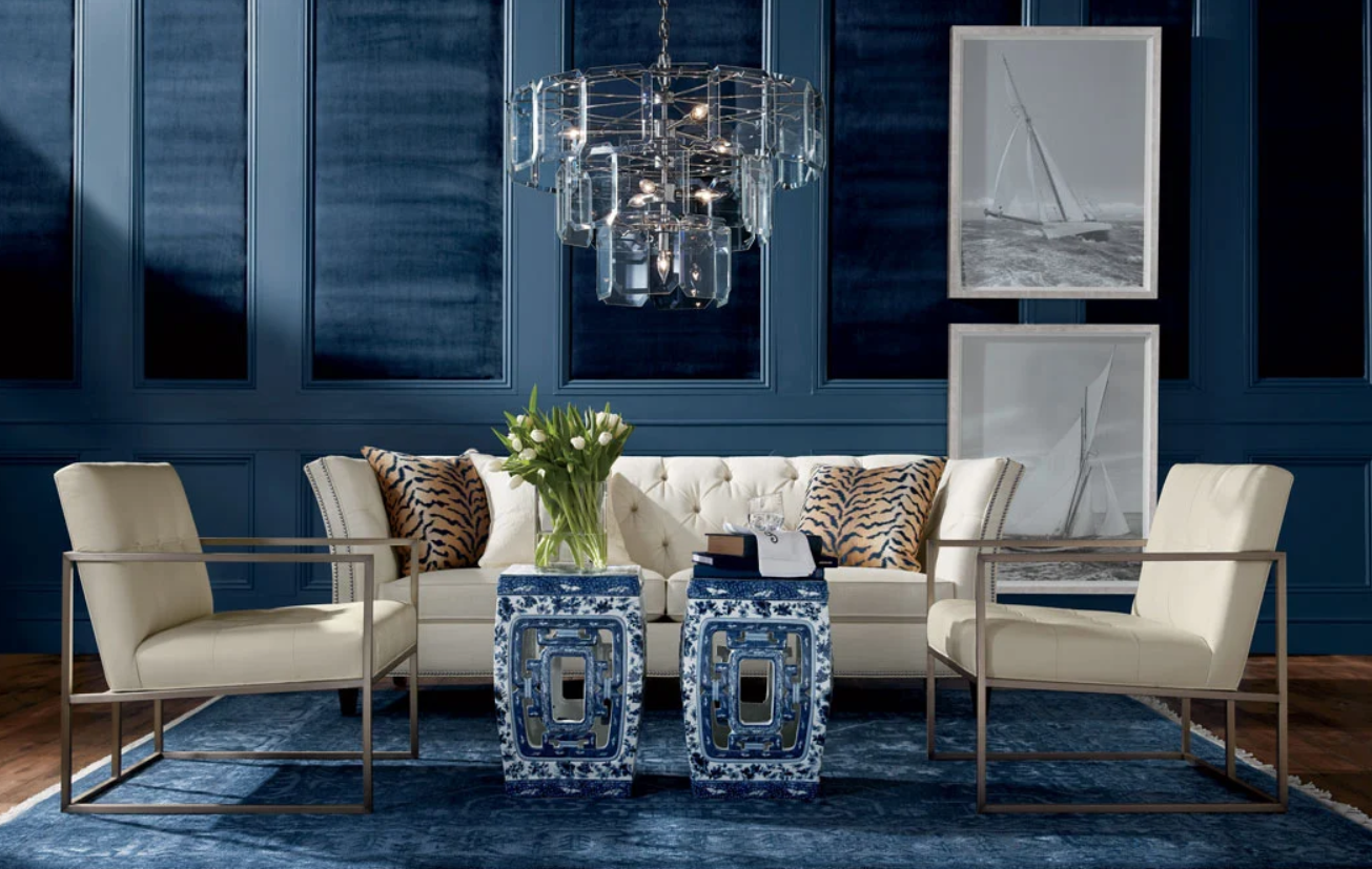
Photo Courtesy of our Partners at Ethan Allen
Facts, History, & Symbolism

Photo Courtesy of Trippaluka Style
75 countries have the color blue in their national flag
Blue is the least common color food we eat.
The term “blue-chip” relates to stocks of high quality, value, and/or reputation.
“Singing the blues” and “feeling blue” are common American phrases in which the word “blue” refers to sadness.
The phrase “once in a blue moon” means an event that occurs rarely or infrequently.
Blue is the favored color choice for toothbrushes.
Many southerners paint their porch ceilings haint blue to repel bugs and evil spirits.
Owls are the only birds who can see the color blue.
Historians concluded that the word "blue" did not exist in Greek times.
Some theorize that the people of ancient civilizations were unable to perceive the color blue in our visual spectrum. In 2006, Jules Davidoff, a psychologist from Goldsmiths University of London, conducted a research project with members of the Himba tribe from Namibia, whose language neither has a word for blue nor distinguishes between green & blue. The results seem to confirm that this theory could be correct, as the tribe members significantly struggled to see the difference between 11 green squares and 1 blue square.

Left: Namibian trib al herders who participated in the Himba color experiment. ( CC BY-SA 3.0 ) Right: Dustin Stevenson color test titled "The last color term", 4/25/2013).

About 6,000 years ago, humans began to develop blue colorants. Dark blue, indigo and cobalt could only be retrieved from a few parts of the world and thus made it hard to ascertain. Lapis, a semiprecious stone mined in the rough and dangerous mountains of Afghanistan, became highly prized among the Egyptians. They used chemistry to combine the rare lapis with other ingredients (such as calcium & limestone) to generate other saturated blue pigments. It was at this time that an Egyptian word for "blue" emerged.
Slowly, the Egyptians spread their blue dyes throughout the word, passing them on to the Persians, Mesoamericans and Romans. The dyes were expensive, so only royalty could afford them. As a result, it was more expensive to use in items such as fabric or paint, and its rarity further increased its value. Thus, blue remained rare for many centuries before it became popular enough to earn its own name in various languages.
The history of blue as "the color for boys" is an even newer notion that primarily arose after the post World War II baby boom. It came about as a marketing scheme, as manufacturers could sell more clothes if some were distinctly for boys, and others were distinctly for girls.

Photo Courtesy of The Sacred Art Institute
The history of blue as a color for everyday man began when the Catholic Church made an important move in the year 431 AD. At this time, the Church decided to color-code the saints, and Mary was given a blue robe. Over time, the shade of blue that Mary wore became what is now known as "navy blue." Because Mary stood for innocence and trustworthiness, the color blue was seen as a positive light. This same navy blue was adopted by militaries and police to convey a similar essence of trust.
As navy blue became more popular among authorities, people began to associate it with the idea of authority. Thus, different shades of blue needed to be developed in order to convey the color's original peaceful, subdued meaning. Robin's egg blue and pale, powder blue were developed for this purpose.
Descendants of royal nobility are called “Blue Bloods” in Europe
According to Greek culture, the color blue is said to ward off their ancient superstition of “the evil eye.” To put this in practice, some Greek people choose to wear a blue charm necklace or bracelet for protection.
In German “blau sein” (literally: to be blue) means to be drunk.
Dark blue is the color of mourning in Korea.
In India, blue is thought to bring bad luck and is associated with mourning.
Blue was traditionally associated with pain in China, and shades of blue are described as shallow or deep instead of light or dark in China.
In Belgium, blue is the traditional color for a baby girl, while pink is traditional for a baby boy.
Color Associations
Blue: Most blues convey a sense of trust, loyalty, cleanliness, stability, intelligence, peace, & understanding.
Light Blue: Peace, Serenity, Ethereal, Spiritual, Infinity
Bright Blue: Cleanliness, Strength, Dependability, Coolness
Dark Blue: Trust, Dignity, Intelligence, Authority, Professionalism, Formality
Psychological & Physiological Effects
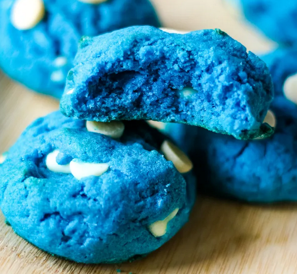
Blue has very few connections to taste or smell. Therefore it may act as an appetite suppressant.
An experiment was conducted with shortbread cookies that were dyed red, orange, yellow, green, blue, & purple. Test subjects were allowed to choose from these six colors, and blue was the least chosen color (with green a close second).
Studies show that the color blue induces calmness and regulates heartbeat & breathing.
Studies show weightlifters are able to handle heavier weights in blue gyms.
Blue is often used to decorate offices because research shows that it encourages productivity and creative problem solving.
In Feng Shui
Blue represents the Water element in Feng Shui and dominates the North of the Bagua Map in the Career section & Northeast in the Skills & Knowledge section. It also works as an accompanying color to the East (Health) and Southeast (Wealth) sections. It should be avoided in the South (Fame & Recognition), Southwest (Love & Relationships), and Northeast (Education) sections, as it is considered destructive here.
If you don’t know what Feng Shui is, we’ll be discussing it in a later post, so stay tuned!
In Nature
The sky, ocean, blueberries, hydrangea, emperor butterflies, blue jay, blue crab, peacocks, Siamese fighting fish, agate, aquamarine, sapphires, & more!

In Marketing
Blue is the most commonly used color in corporate identity.
Dark Blue has been used greatly in logo development of conservative or traditional companies.
In branding and advertising, blue is often used to market those products and services which are associated with technology, networking, and money.
Popular Brands Associated with the Color Blue: Samsung, Lowes, LinkedIn, Visa, Facebook, Walmart, PayPal, HP, Pampers, Delta Airlines, Dasani Water, Pepsi
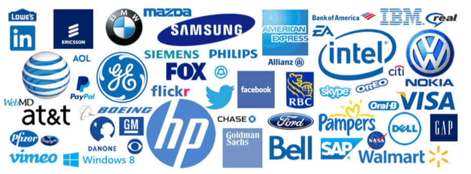
Photo Courtesy of PinImage
In Interior Decorating & Design
Commercial Businesses/Offices - Blue is one of the most common uses for commercial businesses & offices because studies show it increases productivity & creative problem solving
Commercial Hospitality (Hotels, B&Bs, Vacation Rentals) - Blue rooms are great in hospitality because they are related with cleanliness & trustworthiness. In addition, blue is a calming color that is shown to induce sleep, granting your guests a restful stay.

Kitchen - Studies show that blue tends to decrease your appetite, so keep that in mind if you’re planning a blue kitchen. This may be a great way to lose weight or keep costs down and subtly save money when hosting guests. Blue kitchens are a popular contemporary look - especially when combined with silver or brass finishes & white countertops and/or cabinets.
Dining Room - Formal dark blue Dining Rooms tend to look classy and sophisticated. If you’re looking to impress your guests, a dark or navy blue wall will go a long ways!
Breakfast Area - A light blue keeps your breakfast area feeling light & airy - perfect for relaxing mornings!
Living Room - Blue is a great staple color in living rooms because of its universal love from everyone. However, be sure to balance it out a bit with some warmer colors to keep it from feeling too cold & uninviting.
Bathroom - Blue bathrooms feel nice & clean. Plus, light blue bathrooms sell (on average) for over $5,000 more.

Photo Courtesy of Belk
Bedroom - Painting your bedroom blue is a great idea because it helps induce relaxation & sleep; however, if you’re in a relationship that requires a little more bedroom intimacy, it would be beneficial to add in some more sensual accents to keep it from being too dull. Dark blue bedrooms tend to sell for higher prices as well.
Nursery - Blue is a great color for nurseries due to its calming properties. Although it is traditionally used for baby boys in most countries, more modern nurseries are incorporating muted gray-blues regardless of gender. If you’d prefer to add some femininity, pale pinks and/or purples work well in conjunction with blue.
Laundry Room - Laundry Rooms are my go-to for doing whatever the HECK you want to do. You don’t spend a ton of time in there and visitors aren’t checking it out, so feel free to make it as “YOU” as you want to. Even if you eventually plan to sell your home, no buyer is going to back out because they don’t dig your laundry room’s vibe. Go wild with colors, patterns, etc. You have my permission. Follow your heart. With that being said, powder blues are popular in laundry rooms because they look so clean, fresh, & light.
Garage - Blue can work in a garage if you’re a big fan of the color, but from a psychological perspective, it doesn’t have any real benefits.
Man Cave & Gaming Rooms - Depending on the vibe you’re going for, blue can either do well or be a hindrance in these rooms. If you want to keep your space as a place to chill out & relax, go for it! If you’re looking for high-energy, keep the blue limited to a few accents or make it bright.
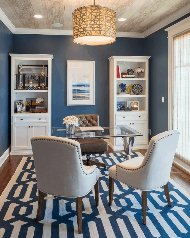
Home Office - You can’t go wrong with using blue in your home office. Light blue will help calm & relax your mind so you don’t stress out; medium blue will stimulate productivity; bright blue will energize your space; and dark blue will make it feel formal and professional.
Home Gym - Studies show weightlifters are able to handle heavier weights in blue gyms, so if you’re looking to strength train, this could be a great fit! Cardio? Not so much.
Home Library - Dark blue works well in a formal home library to add sophistication to the space. Light-medium blue may be too relaxing to focus on reading and/or studying.
Other Interior/Exterior Decor Notes - Blue is one of the most commonly used colors on front doors & shutters. Haint blue is a popular color for porch ceilings (especially in the south).
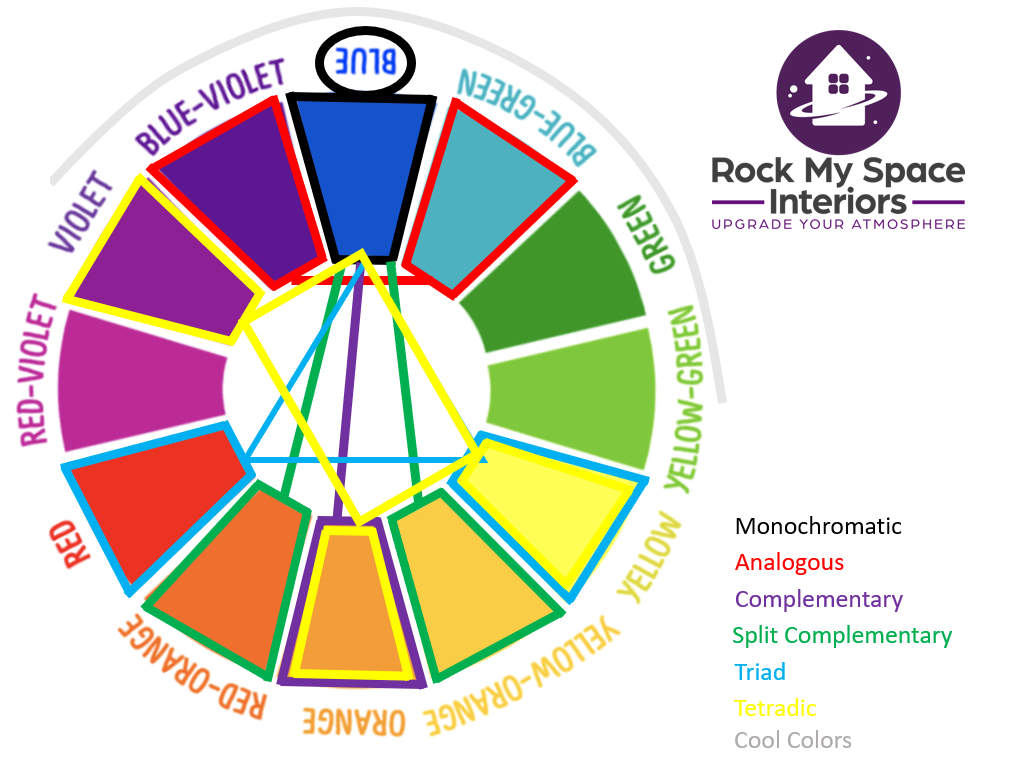
Color Wheel Palette Suggestions
As explained in our color wheel guide, the following color palettes are recommended for blue spaces (including varying shades, hues, chroma, & neutrals):
Monochromatic: Blue
Analogous: Blue-Violet, Blue, & Blue Green
Complementary: Blue & Orange
Split Complementary: Blue, Red-Orange, & Yellow-Orange
Triad: Blue, Yellow, & Red (The Primary Colors!)
Tetradic: Blue, Yellow, Orange, & Violet
Cool Colors: Violet, Blue Violet, Blue, Blue-Green, Green, & Yellow-Green
Common Shades of Blue

So there you have it! A lot of information about the color blue.
Ready to incorporate some blue into your space? Feel free to contact us if you have any questions or need help! And of course, we’re continuing our deep dive into colors in the coming weeks, so be sure to subscribe to stay in the loop. We appreciate you!
-Rockin’ Robyn