
All About the Color Red
Ah, red: the color of PASSION…
If I’m being completely honest, I’m not a fan. It’s a little too harsh and dramatic for most spaces on a large scale, but let it be known that Rock My Space doesn’t skip out on topics just because they aren’t our cup of tea.
“Red is not just a color. It is enthusiasm. It is happiness. It is energy. It is anger. It is love. ”

Photo Courtesy of Roy Home Design
The Basics
Red is a Warm Color & a Primary Color. Red has the longest wavelength of all colors on our spectrum, and its high visibility is why it is often used to trigger alertness (such as on fire engines and stop signs). Red is the first color that human babies are able to perceive after black and white (unless they are one of the 8% of men who have red/green color blindness). According to Ohio State University, the color red focuses behind the retina, which forces the lens of your eye to become more convex to pull it forward; therefore, we perceive red areas (such as text and images) as if they were moving to the foreground.

Photo Courtesy of Ohio State University
History, Facts, & Symbolism
In ancient times, red clothing was reserved for nobles due to its expensive manufacturing process, which included making dye from a little bug in Mexico called cochineal.
Because paint was originally expensive for farmers to use, they sealed their barns with a recipe consisting of linseed oil, milk, lime, red iron oxide, and/or rust, which resulted in a red color. The red-colored barn became standard, leading to the majority of people continuing to paint their barns red.
Over 30% of all national flags include the color red.
Areas where prostitutes work are often called red-light districts.

Photo Courtesy of India Bazaar Online
In China, red symbolizes luck & prosperity. In Japan, red symbolizes "expelling demons and illness.” In India, red is considered holy & represents a specific moment in life. In South Africa, red is associated with mourning. The Russian word for red, "krasni," was, in the past, also used to describe something beautiful, good, or honorable. In Western countries, red and green are commonly recognized Christmas colors. In Christianity, red is associated with the Crucifixion & the Devil. In Judaism, red Red symbolizes blood and sin. In Hinduism, red represents sensuality & purity. In the Seven Chakras, red represents the root chakra, which grounds people through challenges.

Photo Courtesy of Homedit
Color Associations
Red: Passion, Love, Lust, Sexuality, Confidence, Energy, Violence, Danger, Anger, Importance, Impulsiveness, & Adventure
Light Red: Joy, Sexuality, Passion, Sensitivity, & Love
Pink: Romance, Love, Sensitivity, Joy, Passivity, & Femininity
Dark Red: Energy, Anger, Leadership, Courage, Superiority, Sophistication, & Seriousness
Reddish Brown: Autumn, Nature, Comfort, Warmth, Masculinity
Psychological & Physiological Effects

Temporarily Increases Blood Pressure & Heart Rate
Speeds up Metabolism & Increases Appetite
Stimulates Alertness & Taking Quick Action
Increases Athletic Performance When Worn
Increases Aggressiveness
Decreases Intellectual Performance on Cognitive Tasks
Males Wearing Red are Viewed as More Dominant & Powerful
Females Wearing Red are Viewed as More Attractive
In Feng Shui
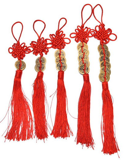
Photo Courtesy of Zen Shop World
Red represents the Fire element in Feng Shui and dominates the Center South of the Bagua Map in the Fame & Reputation section. It also works as an accompanying color to the Southeast (Wealth & Prosperity) and Southwest (Love & Marriage) sections. It should be avoided in the East section (Children, Creativity, & Communication), as it is considered destructive here.
If you don’t know what Feng Shui is, we’ll be discussing it in a later post, so stay tuned!
In Nature
Roses, Rubies, Garnets, Strawberries, Raspberries, Cherries, Chilis, Pomegranate, Cranberries, Tomatoes, Maple Leaves, Autumn Leaves, Parrots, Cardinals, Ladybugs, Lac Beetles, Cochineal, Crabs, Lobsters, Fire, Blood… and much more!
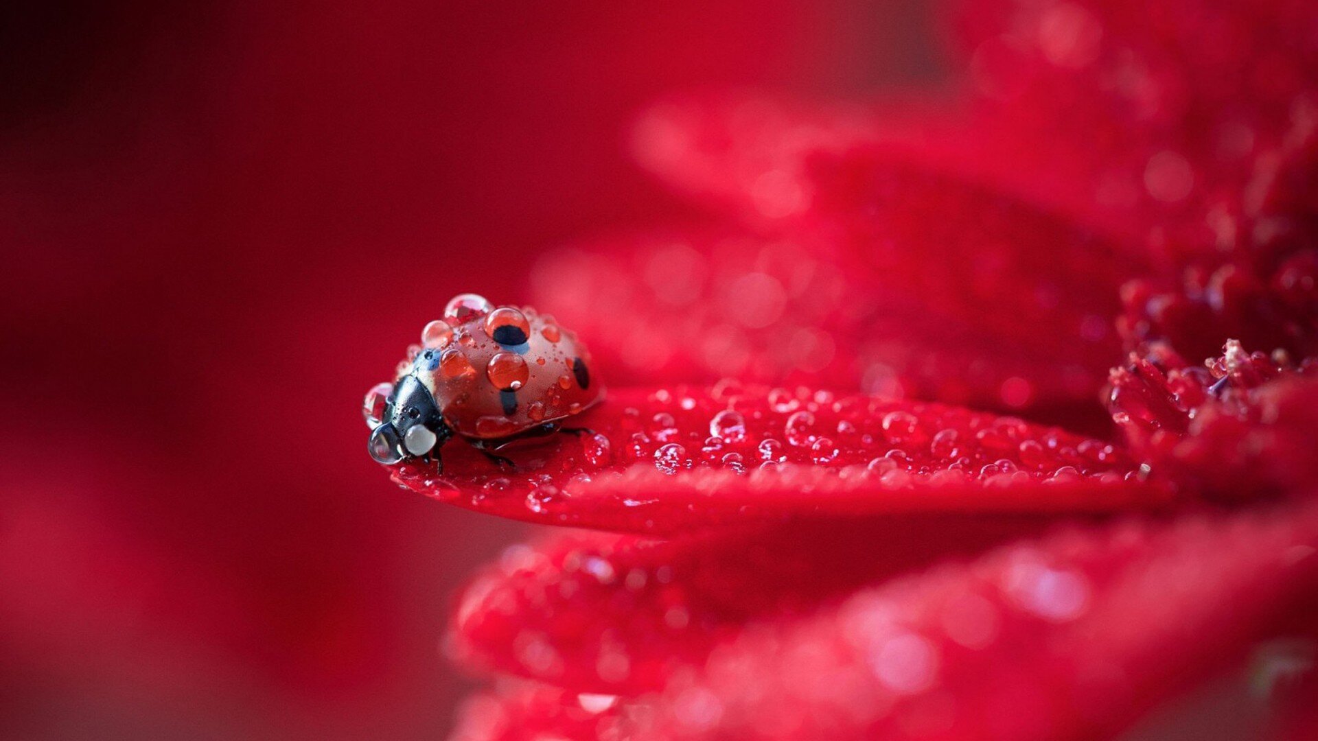
Photo Courtesy of Wallpaper Better
In Marketing
Approximately 30% of the Top 100 World’s Most Popular Brands use Red in their Logos
Red is Commonly used for “Buy Now” and “Click Here” Buttons because it Catches Attention & Stimulates Quick Decisions
Dominant Marketing Fields: Food & Drink, Athletics, & the Automotive Industry
Popular Brands Associated with the Color Red: Coca-Cola, McDonalds, Netflix, Red Bull, Nintendo, Toyota, KFC, Wendy’s, Chik-fil-a, & Pinterest

Photo Courtesy of The Daily Designs
In Interior Decorating & Design
Commercial Businesses/Offices - Companies should exercise caution when using the color red because it is quite powerful. It does well in areas where negotiations & deals are being made, in areas that involve lots of physical labor, and in energetic environments that require employees to be super-productive; however, it can evoke feelings of aggression and stress.
Commercial Hospitality (Hotels, B&Bs, Vacation Rentals) - Red rooms in Hospitality pretty much only work if you’re going for a sexy brothel look or one styled in an Asian theme. Otherwise, it’s best to avoid using red so as not to heighten negative emotions that may result in an unhappy customer. This could lead to them mistreating you or your staff, leaving negative reviews, or potentially even damaging property due to anger. If you insist on using red, try to keep it behind the bed and/or use softer, lighter tones of red & pink.

Photo Courtesy of Catchlight Painting
Kitchen - Studies show that red tends to increase your appetite, so keep that in mind if you’re planning a red kitchen. This may be great if food is an important part of your culture or you are trying to gain weight, but for many Americans, it may be problematic. However, red kitchens are a popular modern look - especially when combined with sleek chrome.
Dining Room - Formal dark red Dining Rooms tend to look classy and sophisticated. Red is a great color in formal dining rooms partially because it is so indulgent, so feel free to eat and drink wine to your heart’s content!
Breakfast Area - I’d skip the red in breakfast areas, which tend to be more relaxed and happy spaces. If you insist on having red here, pick a pale red or pink to lighten up the mood.
Living Room - Red in living rooms is fine so long as it is used in moderation. It’s commonly used as an accent color in rugs, curtains, throw pillows, or other decorative objects; however, I’d skip the red walls. Light to medium red walls are an eyesore, and dark red walls are usually reserved for more moody areas, so putting them in a living room kills the drama. Alternatively, brownish-red walls do well at providing a cozy setting for relaxing with family & friends, especially when paired with leather furniture.
Bathroom - Red also serves as a great accent color to bathrooms, but should be balanced out with plenty of other lighter colors to keep from feeling overwhelming.

Photo Courtesy of Trendir
Bedroom - You can spice things up in the bedroom with a little sexy red, but limit paint/wallpaper to the wall behind your bed so that it doesn’t negatively effect your sleep or increase arguments with your significant other. A pale red or pink will also work nicely for getting in the romance without the arguing that more powerful reds bring.
Nursery - Babies are easily overwhelmed & overstimulated and have trouble sleeping to begin with. Red is also the first color they see after black and white. Oh, and remember how aggressive red can make you? Keep red out of your nursery to the maximum extent possible (unless it is a calming neutral pale red or pink).
Laundry Room - Laundry Rooms are my go-to for doing whatever the HECK you want to do. You don’t spend a ton of time in there and visitors aren’t checking it out, so feel free to make it as “YOU” as you want to. Even if you eventually plan to sell your home, no buyer is going to back out because they don’t dig your laundry room’s vibe. Go wild with colors, patterns, etc. You have my permission. Follow your heart.

Photo Courtesy of NextLuxury
Garage - As noted above in the marketing section, red is big in the automotive industry. It’s loud and fast and energetic and better-than-you. There are some really sleek looking red garages out there, but note that depth perception problems may cause you to park farther away from any red walls. Depending on the size of your garage, you may want to take this into consideration.
Man Cave & Gaming Rooms - Depending on the vibe you’re going for, red can either do well or be a hindrance in these rooms. If you want to keep them high energy, go for it! If you’re looking for a place to chill out, keep it limited or go with softer reds & pinks.
Home Office - Use red in your home office if negotiations & deals are being made there, your job involves lots of physical labor, you need to be super-productive, you need to be more aggressive & assertive, or you’re trying to look powerful & important. If none of those apply, skip the stress for a more calming color (pale reds and pinks work for this too, just not anything medium-dark).
Home Gym - Red works well in gyms because of its effect on energy, alertness, and confidence. Studies even show that people who wear red jerseys in combat sports have a higher chance of winning than those who wear blue jerseys! Plus it gets your blood pumping & heart thumping. Nice.

Photo Courtesy of Bruce Bierman Design
Home Library - Because red is high energy and decreases cognitive functionality, I’d advise against using any bright shades of red in libraries. However, dark and brownish-reds can look great in here with their coziness - especially if you incorporate leather-bound books & furniture!
Other Interior Decor Notes - Red is one of the most commonly used colors on front doors, carpets, and barns. Deep reds are a great accent color in wine cellars.
Color Wheel Palette Suggestions
As explained in our color wheel guide, the following color palettes are recommended for red spaces (including varying shades, hues, chroma, & neutrals):
Monochromatic: Red
Analogous: Red-Orange, Red, & Red-Violet
Complementary: Red & Green
Split Complementary: Red, Yellow-Green, & Blue-Green
Triad: Red, Yellow, & Blue (The Primary Colors!)
Tetradic: Red, Blue, Green, & Orange
Warm Colors: Purple-Red, Red, Red-Orange, Orange, Orange-Yellow, Yellow

Common Shades of Red
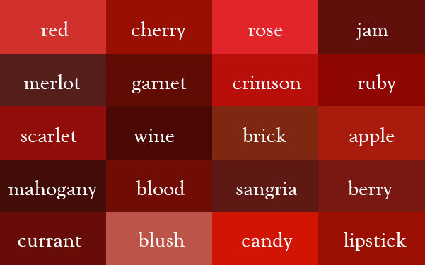
Photo Courtesy of Laughing Squid
So there you have it! A lot of information about the color red.
Ready to incorporate red into your space? Feel free to contact us if you have any questions or need help! And of course, we’re continuing our deep dive into colors in the coming weeks, so be sure to subscribe to stay in the loop. We appreciate you!
-Rockin’ Robyn