
The Color Wheel: A Guide to Creating Your Dream Palette
“Color! What a deep and mysterious language - the language of dreams.”

Photo Credit: Ideal Home UK, Tim Young
Colors are neat. They directly impact our moods & emotions, hunger, productivity, energy, and health. Marketing agencies, artists, fashion designers, film directors, and many other professionals regularly utilize colors to create the desired psychological responses from their audience. Countless studies have been conducted on the response to the use of different colors in workplaces and schools. Naturally, colors are also an extremely important aspect of interior decorating and design, but people often struggle with developing their own color palettes.
We’re acknowledging that struggle with guidance on how to effectively use the color wheel. Read on to get started developing a desirable color palette for your space in no time!
How to Use the Color Wheel to Create a Palette (Quick Start):
Select an Initial or Primary Color
This can be your favorite color, one that suits the type of space you’re designing, one that is already prevalent in your project space, one based on the principles of feng shui, or one that induces a desired psychological response. If you’re having trouble selecting your “starting off” color, be sure to subscribe to our blog. We’ll be diving into individual colors each week with relevant information to consider.
Implement the Color Wheel Methods
Find your initial/primary color on the color wheel, and write down the results you get for using each of the preferred methods (Monochromatic, Analogous, Warm/Cool Colors, Complementary, Split Complementary, Triad, and Tetradic). If you’re unfamiliar with these methods, we will describe them and show an example of each further into this post.
Select the Most Appealing Color Results
Once you have the results of all of the different preferred methods, select whichever one is most palatable to your personal tastes and existing decor (if applicable).
Play with Hue, Value, & Chroma
Start with a base range color for each of your selected colors, and then start adjusting the hue, value, and chroma on each (described later in this post) until you find a pleasing set of colors to baseline your palette.
Don’t Forget Neutrals!
Remember that black, white, brown, and gray are all colors as well (though they are poorly represented in the basic color wheel view). Try to select at least one that complements your palette since these are all common and easy-to-implement colors. Consider that trim is commonly white, brown wood floors are abundant, and that gray/silver and black are often used in kitchen appliances & electronic devices.
Scale Your Colors (Optional, but Advised)
Determine what amount of color you’d like to see in relation to others in your palette. A general rule of thumb for interior design is to use lighter colors on larger decor pieces and higher areas while using darker colors on smaller decor pieces and lower areas; however, this isn’t the case with areas that need to look more moody or small. By planning out which colors will be abundant vs. dashes/accents, you can avoid making your space look unbalanced.

Photo Credit: iColorpalette
The Color Wheel: Additional Info/Explanations
Isaac Newton invented the color wheel in 1666, which served as the baseline for color theory. Newton understood colors as human perceptions (not absolute qualities) of wavelengths of light. By systematically categorizing colors, he defined three overarching color groups: Primary, Secondary, & Tertiary.
Primary colors are the three pigment colors that cannot be mixed or formed by any combination of other colors. All other colors are derived from these three hues.
Secondary - Green, Orange, & Purple
Secondary colors are formed by mixing two primary colors
Tertiary - Amber, Vermilion, Magenta, Violet, Teal, & Chartreuse
Tertiary (or intermediate) colors are the colors formed by mixing a primary color with a secondary color. While the above examples are commonly used words to describe each of the tertiary colors, these hues typically have two word names based on the mix, and they comprise many different shades: Yellow-Orange, Red-Orange, Red-Purple, Blue-Purple, Blue-Green & Yellow-Green

Chart via racerapk.com
Following Newton’s findings, the study of color advanced to cover the properties of color and their usage in a variety of fields. A color’s properties are: hue, value, & chroma.
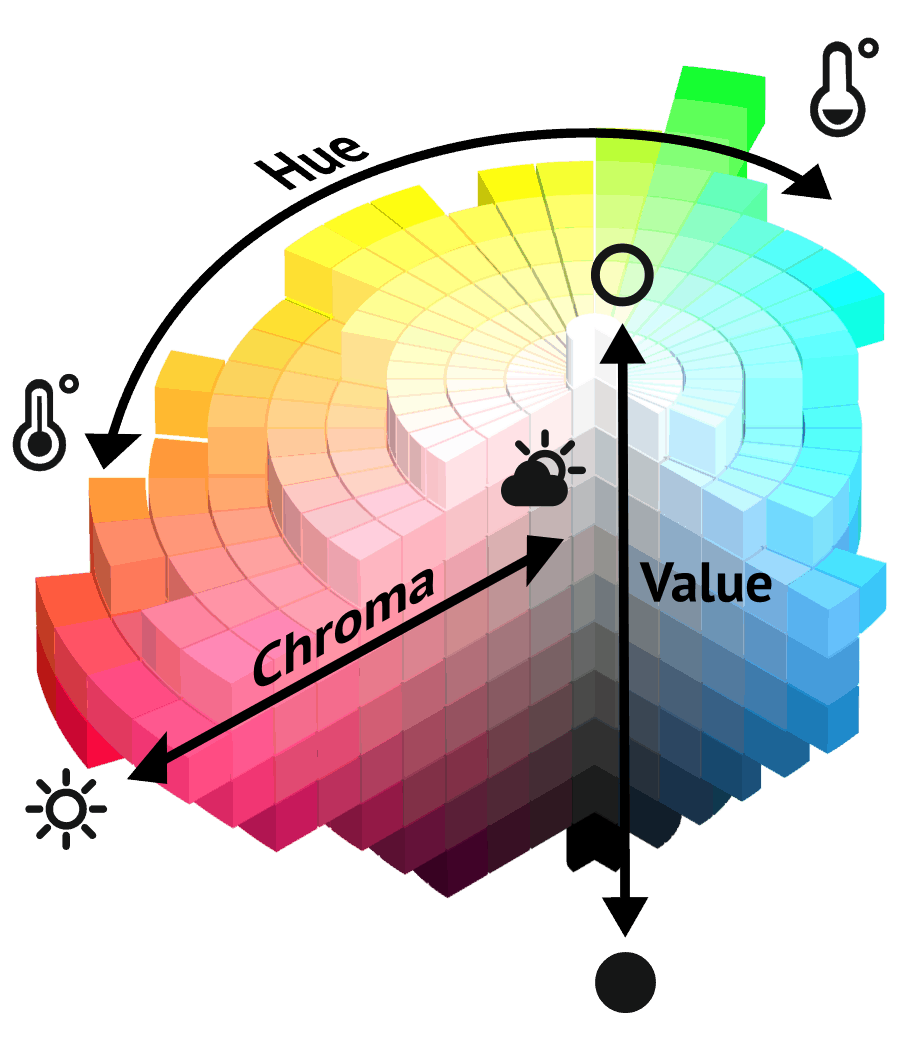
Image Courtesy of color-style.com
Hue
Color Family (Yellow, Green, Etc.)
Value
Tints: Add White
Tones: Add Grey
Shades: Add Black
Chroma
Saturation
Purity
Strength
Intensity (striking vs. dull)
As you can see, the simple color wheel gets a lot more complex when these three elements are introduced, giving an infinite number of possible palette color combinations. Pretty neat, huh?
Color Wheel Methods:
Monochromatic - Focus on one color column for all elements of design. In order to create depth, these schemes usually use multiple hues, tints, tones, and shades of the same color. In interior decorating & design, the utilization of mixed patterns and/or textures also bring interest in to keep things from feeling too boring or flat. Monochromatic spaces are great at bringing out drama or coziness, but they do best when all aspects of the area (including ceilings & trim) are monochromatic - a feat some individuals are hesitant to commit to.
Analogous - Focus on two to three colors next to one another in the color wheel (such as purple-blue, blue, and blue-green). Similarly to monochromatic schemes, these palettes blend well together without fighting for attention, but they also give a little more leniency towards your options for decor elements.
Warm Colors - Focus on colors from yellow to red-purple in the color wheel. Warm colors create a sense of coziness (especially in darker, muted shades) and give energy to space when used in lighter & brighter hues.
Cool Colors - Focus on colors from purple to green-yellow in the color wheel. Cool colors make areas feel larger, and lighter, brighter hues make it feel clean & airy.
Complementary - Focus on two colors that are direct opposites in the color wheel (such as blue and orange). These colors are different enough to stand out on their own, but don’t clash when used correctly in an area.
Split Complementary - Focus on one accent color and two primary colors on each side of it’s direct opposite in the color wheel. Similarly to complementary palettes, the split complementary selects a very different color by reaching across the color wheel. However, instead of selecting one color from the direct opposite side of the color wheel, two are selected: one from each side of what would be the standard complementary color. As an example, turquoise’s direct opposite is orange-red; however, orange & red are on either side of orange-red, so those would be the colors you selected with your turquoise palette in a split-complementary arrangement.
Triad - Focus on three colors which each have three colors in between them in the color wheel. As the name implies, three colors are selected that form a triangle shape within the wheel. There are three colors separating each triad color, which means a dramatic difference in each selected color. These palettes can be a little too loud for most people’s tastes unless they are pared down and muted a bit in hue, tint, tone, or shade.
Tetradic - Focus on four colors in a rectangle shape in the color wheel. This one is a little tougher to explain, but the basic gist is this: there are two complementary color pairs rotated 60 degrees from each other. Getting the correct shades & saturation of four separate colors is a little more difficult (even for the seasoned professional), so I’d recommend shying away from this option unless you are an eclectic maximalist.
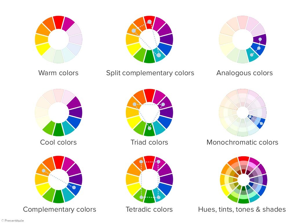
Image Courtesy of Presentitude
Phew! That was a lot of ground to cover!
If you’ve read this far and need a refresher on what to actually do with this information, scroll on back to the top for the “Quick Start” instructions and reference back to the additional info as needed. If you’re still struggling, reach out to us and we’ll help guide you in the right direction. The great thing about the color wheel is that you only need to select one color to begin your project. You can then apply the above methods to see different palettes and decide which one is most visually appealing or suited for your project!
Still not sure which color to start with? In the coming weeks, we’ll share posts on specific colors, their known psychological & emotional responses, cultural associations, feng shui areas, and best rooms/environments to incorporate them in. Be sure to subscribe so you don’t miss out! <3
-Rockin’ Robyn